viewport sizes device pixel ratio

Today I was device testing a website and at some point I realised that I don't have a clue what viewport size, the device I was testing on has.
device pixel ratio
The manufacter tells 2560px times 1600px, but do these values matter in web design? Quick answer no - because there is something called "device pixel ratio" which is a pretty cool technic, where the operating system "put" real pixels into a square and all applications take the number of theses squares as resolution.
The operating system uses this sub-pixel for smoother edges on round corners or fonts or everything it can render in a real high density.
Now I know that the device I was testing on, has a dpr-value (device-pixel-ratio) of 2.125 - my mobile device has a dpr of 2.5 and your devices will have all possible values.
Back to my problem - I did know the physical resolution of this device but this value did not help me to evalute the render result of the website. I did not have access to devtools in this situation and so I thought "Alright maybe the dpr value is around 2, so the width in landscape is around 1280px and so these media-query range is applied to what I am seeing".
This was frustrating and so I sit down this evening and wrote a super small website, to read out all the CSS values that are important to see why a device is using this or that media query range.
Just visit viewports.raoulpilop.de and get all the information you need.


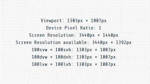
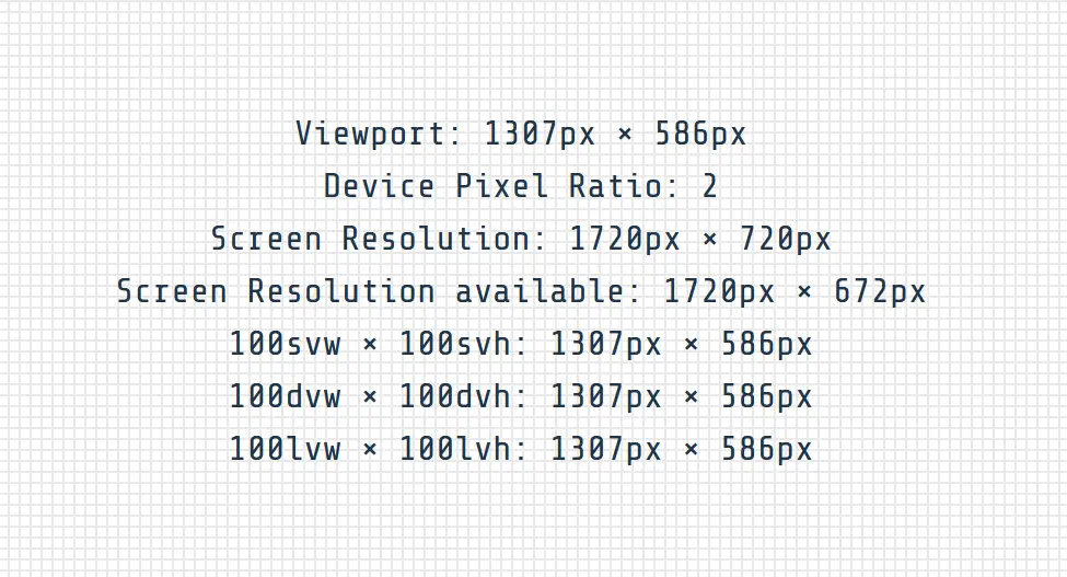
These are screenshots of viewports.raoulpilop.de from the same browser window with different device pixel ratios.
the values
Viewport - shows the current viewport of your browser window
Device Pixel Ratio - the value how many physical pixels are squared together
Screen Resolution - the width and height of the actual screen. If the browser is not in fullscreen, this value differs from viewport
Screen Resolution available - if the operating system has "fixed" bars, these bars take their space and this value keeps this in mind
And the 3 other values are the rendered size of divs with width: 100svw; height: 100svh and width: 100dvw; height: 100dvh; and width: 100lvw; height: 100lvh.
Depending on your operating system, these values are all the same. But swv/swh represents the minimal viewport, showing the width and height whose are always available.dvw/dwh is dynamic viewport and will change if a searchbar or urlbar moves out of the window.lvw/lvh is large viewport and gives always the maximum viewport possible, disrespecting if a searchbar/urlbar is visible or not.
I think I sometimes use the dvw/dvh values for modal dialogs.
update 29th october 2024
In that same project I created this page for, I added a CSS Touch/Non-Touch detection like this:
@media (pointer: coarse) and (hover: none) {
  /* touch only styles */
}

@media (pointer: fine) and (hover: hover) {
  /* non-touch styles */
}
Today I had to find out, that samsung touch-devices tells the browser that they do have hover! The code above left samsung devices without any css at all.
So I updated the detection to this:
@media (pointer: coarse) or (hover: none) {
  /* touch only styles */
}

@media (pointer: fine) and (hover: hover) {
  /* non-touch styles */
}
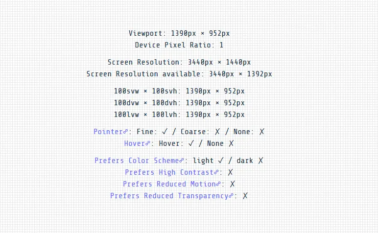
Lesson learned and after work I updated directly my viewports page, to query for pointer and hover media queries and for prefers-* media queries too:

tools
This is a small vite vanilla project and you can look at the code here: https://github.com/djpogo/viewports.
favicons are created by https://favicon.io/favicon-generator/ - my "go to" for favicons.
