CSS, Dark-Mode and Custom Properties

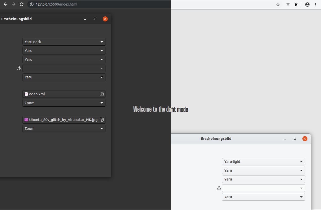
The other day, I was reading about "dark mode" and about the prefers color scheme media query, and... how cool is that?
Often a customer requirement is to support the IE 11 and than you put yourself under that ie11-rock to "play it safe". On private projects I used up to date features, but on work I promoted ie11 for tech-doorkeeper.
At bold ventures, we have many progressive web apps in our pipeline, making me thinking about leaving the old f(r)iend ie11 and to move on.
I started with a simple test for dark mode detection and use Custom Properties for that, and... how cool are these (again)?
:root {
  --bg-color: hsla(0, 0%, 90%, 1);
  --text-color: hsla(0, 0%, 20%, 1);
}
*,
*::before,
*::after {
  box-sizing: border-box;
}
html {
  width: 100vw;
  height: 100vh;
  max-width: 100%;
  min-height: 100%;
  display: flex;
  overflow-x: hidden;
  margin: 0;
  align-items: center;
  justify-content: center;
}
body {
  background-color: var(--bg-color);
  color: var(--text-color);
  font-family: 'Big Shoulders Text', cursive;
  transition: color .2s ease-in, background-color .2s ease-out;
}
.mode::after {
  content: "light";
}
@media (prefers-color-scheme: dark) {
  body {
    --bg-color: hsla(0, 0%, 20%, 1);
    --text-color: hsla(0,0%, 80%, 1);
  }

  .mode::after {
    content: "dark";
  }
}
The complete html page is available in this gist:
<!DOCTYPE html>
<html lang="de">
<head>
    <title>I'm in the mode</title>
    <meta charset="utf-8">

    <meta name="description" content="Sometimes I ran…">
    <meta name="viewport" content="width=device-width, initial-scale=1">
    <link href="https://fonts.googleapis.com/css?family=Big+Shoulders+Text&display=swap" rel="stylesheet">
    <style>
        :root {
            --bg-color: hsla(0, 0%, 90%, 1);
            --text-color: hsla(0, 0%, 20%, 1);
        }
        *,
        *::before,
        *::after {
            box-sizing: border-box;
        }
        html {
            width: 100vw;
            height: 100vh;
            max-width: 100%;
            min-height: 100%;
            display: flex;
            overflow-x: hidden;
            margin: 0;
            align-items: center;
            justify-content: center;
        }

        body {
            background-color: var(--bg-color);
            color: var(--text-color);
            font-family: 'Big Shoulders Text', cursive;
            transition: color .2s ease-in, background-color .2s ease-out;
        }
        .mode::after {
            content: "light";
        }
        @media (prefers-color-scheme: dark) {
            body {
                --bg-color: hsla(0, 0%, 20%, 1);
                --text-color: hsla(0,0%, 80%, 1);
            }

            .mode::after {
                content: "dark";
            }
        }
    </style>
</head>
<body>
    <section class="hero">
        <h1>Welcome to the <span class="mode"></span> mode</h1>
    </section>
</body>
</html>
For Custom Properties there exists ie11 po[n|l]yfills at npmjs:
* css vars ponyfill (+6.9 KB says bundlephobia)
* ie11 custom properties (+ 3KB says bundlephobia)
* and more...
Custom Properties have a real good browser support, so you can ditch most of your SCSS variables and put them where they belong (in the browser) and enjoy the power of this feature! And with the polyfill, ie11 visitors will see your default theme (dark or light), so this whole technique is customer project ready!
